UV ARRANGEMENTS
Arranging the uvs for the robot is quite challenging cause there are a lot of parts involved.
Firstly I just unwrapped them (for my case its head) to be on different UV tile spaces
Then after that we decided on one tile space so we have to group the robots in parts:
- group by MIA
- group by parts
before I initiated the change, I tried to adjust the layout option to see how Maya arranges all the UVS on a designated tile space
Here as the settings I tweaked for this case. You might want to check the Layout Settings more, cause I set it to Uniform especially for scale to have them equal sizes.
I found it a very messy way cause it locks me out of the freedom to place my UVS as it plays a vital role in texture placements later.
NORMALS FLIPPED:
It's a very redundant mistake to have it around but since while doing texturing, there's still room to fix and adjust it. It might be a cliche mistake, we should still always make sure we do it right
UV FOR THE LEGS:
Remember to always make the UV sizes the same! That's one of the problems we faced in texturing. Since I'm doing the leg, I'll show you how I arranged all the parts of it for a clean and neat UVs.
This is the first layout I made before we assemble everything later. This is just for me to work easily on the UVS by grouping them first on their polygonal parts.
I believe this is a quick easy step cause later when we decide to change the overall scales of our UVS, it's going to be faster to adjust here and there.
Here are some pictures I took of my Outliner and my leg parts.
in this case for the foot, I let it remain like this cause we have a hero shot of this. There's individual focus on this later on.
IN THE END OF IT ALL, THIS STEP IS MY PERSONAL preference at an early stage, hope it helps!
Tuesday, 1 April 2014
Wednesday, 26 March 2014
WEEK 6 ADVANCED BUTLERMECH IDEA
BUTLERMECH PROGRESS:
I came up with another story for our product to work out. This butler is not worth it if all that it can do is just bow and serve. There's like a low amount of motion with it, like for example a scene where this butler can serves you wine, it's very sleek, very elegant on its movements, Total No for that, so I came up with this idea of making it like a bodyguard or your very personal assistant!
I made rough sketches and concepts for this idea!
here are some stuffs I did..
DIFFERENT SKETCHES OF THE BUTLER CONCEPT I MADE INSPIRED FROM ROBOCOP AND OTHERS
using robocop template, I made this rough paint overs to give us idea on how this butler should be able to look like with the bow tie and strong stature. These kind of design didn't kind of work cause it looks like a total robocop rip off.
what's the approach? is it going to be cartoony? or serious? here are some sketches I did for butler where the design speaks for itself, does this butler work in a restaurant serving and at the same time protecting his manager? are we going to compare the old robot model to a new model? it's really complicated cause there's a lot of different point of views that we have to consider.
initially the advertisement flow is so ambiguous cause we kept on being rejected on a suggested idea of a different point of view and opinion. Somehow Ihave to really narrow this down and push through it cause there's another suggestion of doing a RAPTOR commercial. Weeks are crawling fast and work must start soon!
It was so messed up that I can't even start storyboarding, nobody knows how to start the story , what's going to happen in the 30 secs?
I came up with another story for our product to work out. This butler is not worth it if all that it can do is just bow and serve. There's like a low amount of motion with it, like for example a scene where this butler can serves you wine, it's very sleek, very elegant on its movements, Total No for that, so I came up with this idea of making it like a bodyguard or your very personal assistant!
I made rough sketches and concepts for this idea!
here are some stuffs I did..
THUMBNAIL CONCEPTS FOR THE BUTLER'S HEAD
the head must be fierce, back to cylon like appeal, but this one should show sleekness despite it's forceful nature. Designed to protect you and your household from any danger.
using the newly taught zbrush technique of concept drawing using a plane and activating mirror symmetry
DIFFERENT SKETCHES OF THE BUTLER CONCEPT I MADE INSPIRED FROM ROBOCOP AND OTHERS
using robocop template, I made this rough paint overs to give us idea on how this butler should be able to look like with the bow tie and strong stature. These kind of design didn't kind of work cause it looks like a total robocop rip off.
what's the approach? is it going to be cartoony? or serious? here are some sketches I did for butler where the design speaks for itself, does this butler work in a restaurant serving and at the same time protecting his manager? are we going to compare the old robot model to a new model? it's really complicated cause there's a lot of different point of views that we have to consider.
initially the advertisement flow is so ambiguous cause we kept on being rejected on a suggested idea of a different point of view and opinion. Somehow Ihave to really narrow this down and push through it cause there's another suggestion of doing a RAPTOR commercial. Weeks are crawling fast and work must start soon!
It was so messed up that I can't even start storyboarding, nobody knows how to start the story , what's going to happen in the 30 secs?
Labels:
Technical Journal
WEEK 5 - FIRST BUTLERMECH IDEOLOGY
INTRODUCING: THE BUTLERMECH
after moving on from the brobot concept, we came up with the butler idea of a robot. A robot that can help do your needs at home.
Target audience is: high class people, rich, businessman
after moving on from the brobot concept, we came up with the butler idea of a robot. A robot that can help do your needs at home.
Target audience is: high class people, rich, businessman
" HIGH CLASS ROBOT BUTLER
For RICH people, a
sophisticated product for a sophisticated man
"Suave, sleek, smooth...."
SOME POINTS TO CONSIDER:...
Positioning, take a car for example, Volvo chose to say that they are the safest car
when all cars are like that too. So there’s like a stand for our product
"All Around...only with a
lot more style."
"Well,
when ur in advertising, u will still have clients and u still have to please ur
client. Your lecturer is your client (owner of the product) and you have to
work around the limitations he has set.
U can work on that. Show what
your robot can do. Does your dishes, brings u coffee, sets ur appointment, walk
your dog...and still look handsomely suave!" -Randy
USP: The ultimate robot that your money can buy
Not only
does this robot serve you like a real butler, it also is your personal
bodyguard. So why walk with fear on the streets? And always hide when our robot
can protect you! He can assist you in anything you require and at the same
time, your safety is your "priority!"
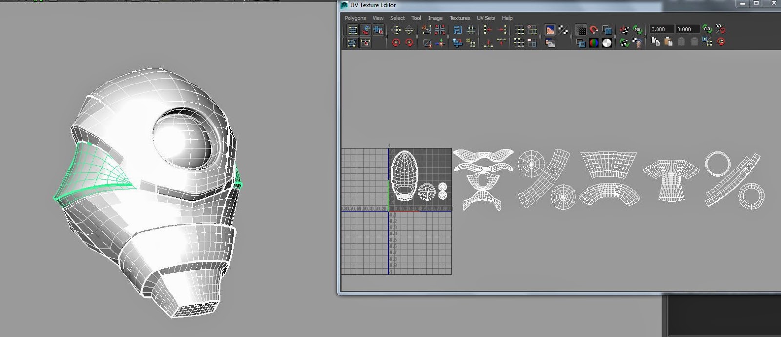
WE tried to go for it presenting the ideas roughly.. i made some different designs for it
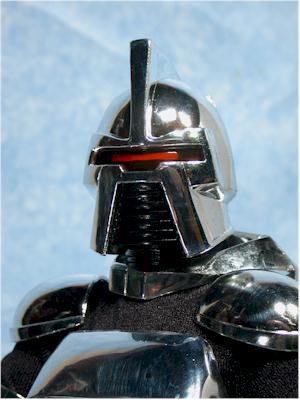
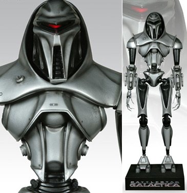
these robot designs are inspired from a cylon. Here are some references
WHAT WORKED? Well the robot design is very sleek, very handsome and suave and simplistic. The main point is that the design must have that luxurious and classical
appeal.
WHAT DIDN'T? The robot design is too aggressive for a butler. We considered the Cylon red laser eye that goes hither and thither but it looks so murderous. My idea was so contradicted for a design cause I really want to have something with some awesomeness in it, something that's worth doing for the next few weeks...
WE PRESENTED THE IDEA BUT WE didn't make it, so I have to constantly fight for the Butler maybe in a different approach or ideology.
BUTLER FOR? RICH PEOPLE? I cannot go General Public, we tried to but it's a huge controversy whether or not are they going to afford it or what?
Why would people of middle level buy this robot? how are we going to approach the commercial? what's the usp? what's the twist? is it technically possible?
We really have to work around the designated standard before us..
If not we have to make the commercial so straightforward without a wow factor. THIS IS BORING.. therefore the next few days I progressed on my idea to further push this ROBOT to a yes!
Labels:
Technical Journal
Monday, 24 March 2014
WEEK 3 TECHNICAL PRODUCTION JOURNAL
Scifi Product/Robot/Mecha Concept Design and Idea Evolution
WEEK 3
Continuation of the last two weeks, here's initially a brainstorming idea process that we had before we went for sci fi.
We procured more ideas that came in. Examples of which is A glove that heals an object. Like whenever you wear it and touched something like a rusty spoon, it will come back good as new, more like a factory reset in computer terms. Refer to the designs I made at the last post for visual references. Next is an idea of mine which was also at that product sheet, It's called 'PortaOcculus' what it does is that it brings you to virtual reality when you wear it but cause disturbances around you cause you'll go nuts touching here and there. I made a rough story board for it
SO IDEAS CAME BUT FINALLY, we came up with one. Like I was thinking why don't we go for a robot? that does what? maybe like your brother, to help you in need or something.
SO THE "BROBOT" IDEA came in to view and I quickly made some character designs for the idea.
I named the character Bobby, he's a small kid who's got a "bro" who kind of helps him to do different stuffs like clean his mess, help him tight corners with bullies, and etc.
HDRI + LOOK DEV'T TECHNICAL JOURNAL
LOOK DEVELOPMENT OF MIA MATERIAL IN B4DA55
and HDRI settings
1. Simply Plug In your HDRi
- with Final Gathering on
- Accuracy to 50
- Primary Diffuse Scale to 2
- Color Gain (HDRI=3)
- Enable Default Light OFF
First of all, let's have the basic understanding of mia material parameters: http://download.autodesk.com/us/maya/2010help/mr/shaders/architectural/arch_mtl.html#parameters
"The mental ray mia_material is a monolithic material shader
that is designed to support most materials used by architectural
and product design renderings. It supports most hard-surface
materials such as metal, wood and glass. It is especially tuned
for fast glossy reflections and refractions (replacing the DGS
material) and high-quality glass (replacing the dielectric material)."
Basically in our example here we're going to be tweaking
Reflection - just how much light is being reflected in the model
Glossiness - The amount to diffuse the shininess
Let's take a look at the first render of the torso with the specifications below.
I added a bit of roughness to tone the specular a little bit.
i noticed that this setting is too shiny and smooth which defy the idea of our robot which is supposed to be a battle worn one. Therefore, let's tweak some of these parameters plus the adding maps to our REFLECTION AND GLOSSINESS.
LET ME EXPERIMENT on some instances of playing around with ref and glo.
R= .6
G= .4
ROUGHNESS= 1
gives you that very soft matte like texture but with a bit of specularity.
Notice that there are some grainy noise on the spec, this is because of the glossy samples, the higher the value the less it flickers but now it's evident because it is set to 8
R= 1
G= .579
GS= 75
ROUGHNESS= 1
R= 1
G= 1
ROUGHNESS=0
R= 1
G= 0
ROUGHNESS=0
after trying out these experiments, we can now have the clear understanding of how reflectivity and glossiness affect it each other.
- reflectivity and glossiness on both power gives us the harshest spec we can ever have
- with the help of glossiness, we are able to tweak the this intensity by somehow blurring it but it varies with its samples. The higher the better, the lower , the noise is worse
- the more we tweak the differences of both, the higher render time it will get
NOW LETS PLUG IN OUR B AND W MAP ON OUR REFLECTION TO SEE THE EFFECT
COLOR PROFILE= LINEAR SRGB
ALPHA IS LUMINANCE
ROUGHNESS = 0
ROUGHNESS = 1
G= .281
not much of a difference! we see that lighter parts are all gradually illuminated based on the map
LETS TRY TO PLUG IT IN GLOSSINESS!
we see that kind that matte-ish carbon like effect
ROUGHNESS= 1
LETS PLUG IN BOTH!
this is what we are looking for! to give that extinct looking metal that has been battle scarred! I also kind of rotated the HDR lighting so we can have a better illumination on what is going on
but.. let me just try to take out the LINEAR in the color profile of the map for both ref and glo and see how it goes..
A very close relationship with the final but this one is a bit darker? i guess it's because of gamma issues.
NOW LETS PLUG THE BUMP!
this one is ample, bumping out the scratches gradually.
BUT! FOR THE FINAL TORSO, WE ENCOUNTERED SOME PROBLEMS WITH THE DISPLAY WHICH IS VERY IMPORTANT!
- remember that enable color management to be ticked with sRGB to Linear
- on your render window - right click- display - color management
this will give us the REAL output of our render.
Render the sequences in .exr formats\
CHEERS!!
Labels:
Technical Journal
Subscribe to:
Posts (Atom)