Wednesday, 26 February 2014

WEEK 7 REFLECTION FILM MEANING

WEEK 7 REFLECTION FILM MEANING

This week we learned all about distinguishing the meaning of films. We were told the different types of meaning like , referential which is basically just the plot summary, explicit meaning is the point of the film like a moral lesson, implicit meaning is like very abstract and it sounds so far fetched in my opinion, and symptomatic which is about social ideology.
We were shown the clip of Wizard of Oz and different Examples of the meaning applied to it by different people.

WIZARD OF OZ (1939)
DIRECTOR:  VICTOR FLEMING, 

While slowly understanding it, my favorite film crossed my mind and I will try now to give its meaning but in different types!
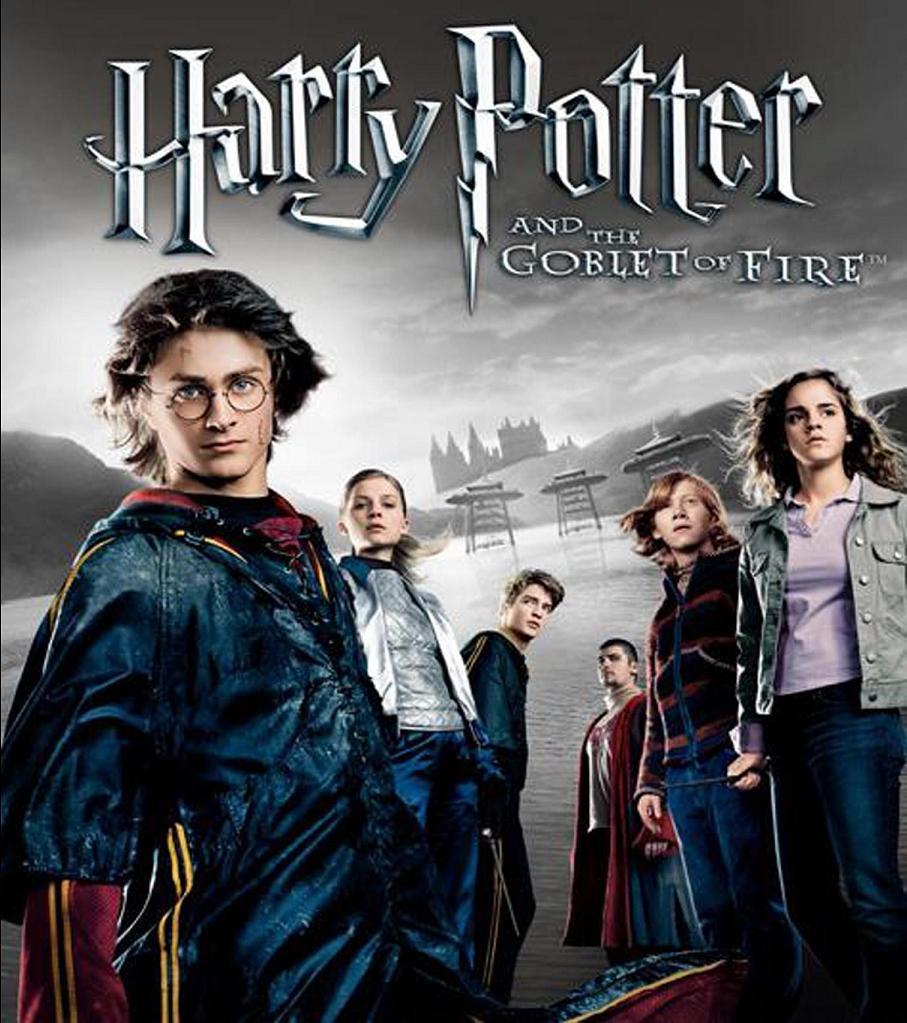
HARRY POTTER AND THE GOBLET OF FIRE
DIRECTOR: MIKE NEWELL
 Referential: Harry Potter’s fourth year at Hogwarts started and with it comes a dangerous journey. Being suspiciously entered to the Triwizard Tournament, he embraked on different life risking situations like facing the dragon,merpeople and inside the wild maze. Only to find out that it’s all a trick to bring him to the graveyard where the Dark Lord Voldemort will return using his blood.
Explicit: A story of a boy on his adolescence standing firm and tested in the wicked times of his life as teenager and to learn how to live a new life of constant vigilance against any threats.
Implicit: A slow blooming flower in the midday sun, blooming through the opposing vines and thorns obscuring its way to reach the sun but soon as it’s petal fully expanded, it’s thorns are ready for defence.

Symptomatic: The association of different schools’ relationship is strengthen for trust. Always create an environment of a healthy competition and smooth rules without any alterations based on sabotage by cheating. 

Sunday, 16 February 2014

WEEK 6 REFLECTION SOUND DESIGN

WEEK 6 Reflection - Sound Design

This week is the continuation of sound design. We learned about how sound can set the narrative role of a scene. We were taught on how to extract and dissect a using by finding out how sound manipulates us with the help of visuals. One example of this this film called "Departures". I am most interested on how sound gives the character and the scene their identities. Moreover, I'm also really drawn to how "silence" accompanied by certain sound fx that are placed timely in the scenes. It creates this empathy for the viewers.
From this film, the rest of the class agreed about the crow sound when he is cleaning the deceased body. It connects us that yes it is a sad scene indeed though they are inside the house.

For my own reflection, another film came across my mind after this understanding came to me. 
The film is called "SHUTTER ISLAND" and I would like to analyze this certain clip for all of us today.


0:00 - 1:27 only
SHUTTER ISLAND
Director: Martin Scorcece
Basically this clip started when it was a very thunderous night inside the cells of the island and we are then taken to Teddy Daniel's dream of guilt.
Let's start with the first scene, we see Daniels and white flashes over his face as thunders lashed outside. The sound was so soft, a little bongk bongk of a gong like instrument. Why didn't the director just fill the sound with thunder claps? I believe that it is because he was trying to build it up so that we can have that controlled tension.

0:15
This is a very disturbing scene. The director chose the right colour scheme to establish this shot with a bit of a rim light on his figure. The mangled bodies creates that very traumatizing feeling as they pile up out of the trains as if they're being ready to be disposed. For the sound, it was really creepy,cause if you listen to it, there's this soft rumbling like an old radio like speech speaking. I think it is done purposely for us to show that this happened long ago and that these corpses or one of them are sort of speaking to him. CREEPY!!!
0:17
Then a piano with notes in octave erupts as the camera suddenly cuts back to him in bed with a flash of lighting then cuts back to the dream! Why would the director allowed such thing when he can just remain on the dream itself? I guess because he wants to tease us, he wants us to build that slow tension that what you're expecting to happen hasn't yet to come.
0:35-39
The honking sound still seem to continue throughout as he walk pass the corpses and remember this scene carefully cause later I'll show something more of it on the next few screencaps.
0:41
At this scene we're still being teased by the director , Daniels' slow turns and breathing brought us here on this cut where there's this two corpses of a mother and a kid frozen dead on the floor. I like how the director is playing with us now here, the game is all about visual and sound effects. In here the sound was very eerie with the same honking AND THEN
0:43
BAM! that awesomely freaking scary octave hits us again full in the head as the camera cuts to him with a steady breathing as of a last breath! This is really exciting, I start to anticipate what will happen even clearly cause the pattern of the trick is getting evident now!
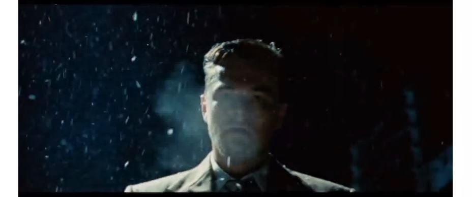
0:50

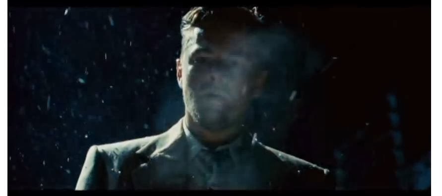
0:51

0:52

0:54
Now these are the scenes that I want to exemplify cause after watching and dissecting I finally got how it all gives us that hook, how the director hooks us visually and with sounds. Take a look at these shots by watching the clip, can't you see the smoke of his breath being rhythmically the same as the bongking sound fx? For me it's really clever! so that's why it all works out just fine, how this horrific suspense kept us tight on our seats! The visual ease of watching and that subconscious understanding of what we see gives us the ability to stay still and just wait for the worse! I think this is really a good hidden technique that is usually overlooked by people and filmmakers. It really gives me the truth that every little thing counts. Now let's go back from 0:35, can't you see the similarity now?
0:55
The corpses now changed to the alleged Rachel Solando and his daughter. With that particular silence to give room for us to empathize with the sadness.
0:57
 A slow cut of silence
THEN!
0:59
BAM! A blood curdling supernatural and evolutionary knocks resounded in the stillness as the kid's eye opened!!!!!!!

 OMINOUS gong like sound going in syncopated crescendo as the camera cuts
YOU SHOULD HAVE SAVED ME, YOU SHOULD HAVE SAVED ALL OF US
 The girl slowly rose up with that gentle face to him and just look at his priceless reaction. I think there's a great contrast there cause the face of the kid is so fine, smooth and gentle and Daniels' face was just so distraught. Moreover, the way she said those words were in a whisper. WHY? I think it shows more emotion as she is dead and she's lifeless but she can speak. Another could be she is too weak and with this manner of saying it she wants to uphold guilt to him. The last one I think was probably the creepiest cause she doesn't want her to be heard by the sleeping dead around them.
Then there it ends with that slow suspenseful sound fx.

Saturday, 8 February 2014

Reflection Week 5 - Sound Design

WEEK 5 

SOUND DESIGN

There's as lot of things i learned this week but we had a recap of the forms of narratives. It's not much of this week's topic but I like the idea of knowing them as they are equally important.

There 2 forms of Narrative,
Restricted is you are only limited of the information that is given to you as you see it on screen
Non-Restricted shows you the bigger picture of things whereby the character doesn't know what's happening but you already have seen it.

Moving on to the the sound design.
I was amazed by the point called "sound is nearer than visual"
cause it's seems pretty straightforward when you read it but actually it's a very deep phrase that ought to know. Basically everything that you watch is distant from you, you get that visual nearness or farness from the screen but sound is the closest to you. I get this imagery in my head that I was sitting in a cinema three rows from the front, and you can't help that this film won't really work out if there's no sound but the beauty of a film is magnetized to us as audience by the naturality of the sound it produces.
Another experience I would like to point is whenever I was working with two monitors at home. I play a movie and use the other monitor to work. I can't really keep myself from gazing to the film cause it will be a distraction but as I work, I slowly get the picture of what's going without looking at it because of the sound.

We learned about diegetic or non diegetic, it's about the sound from the screen and sounds only for us to hear.

We learned about types of sound like speech, sound fx and music. Moreover, we were also taught how to balance all these types in a type of film. For example an action sequence, sound fx is dominant than speech and music. This is useful cause all kind of made sense when watching movies like iron man, we saw the sound evolution from slow to fast or from soft to loud.

We also learned of dimensions of sound like rhythm, fidelity, space and time.
Let me take rhythm for example, it's about matching the movement on screen to the music. We saw the mickey mouse cartoon show and you can see his movements really syncing to the music and fx going on.

Sound can create contrast.
One example will be,
on screen image with offscreen sound
- illusion that the world is  beyond frame
like you saw a cut whereby the camera was facing a man talking and then the next cut is the woman 2 floors above yet the man is still speaking but in a muffled sound. It shows depth and extension.

Overall, the lesson today was a lot to take in and is not yet done :) but actually is pretty interesting

Monday, 3 February 2014

WEEK 2 - TECHNICAL DIARY

MATTE PAINTING RESEARCH / TECHNICAL DIARY 

WEEK 1 -2 

A brief tutorial I made with camera projection and matte painting using AfterFX


Reflection Week 4 - Montage

CONTEXTUAL REFLECTION

WEEK 3

Film Form

This week was fruitful cause the lesson was rich in knowledge of film at its transparent form. What I meant is we start to see things we overlook.
Before anything else I would just like to talk about this film I watched during the weekends and I think that this is one of the movies that I watched not just for the viewing and amusement but as how it is made and staged.
ROBOCOP 2014
After the movie the first thing that I asked for was that ,who is the director? This film seems so different in its cinematography. I felt a sense of French New Waveness going on in the scenes. There are some scenes that I can re-link to Godard's Breathless. I don't want to spoil the film for you guys but watch each frame captured with such natural concentration on how things are placed. The lighting also really brings up the solid mood that they want to convey. There's this one part when Alex came home to his wife and kid, the cinematography is like a modernized french new wave and the camera was never static. I watched this 3 rows from the front and somehow I can see that each scene was just so breathtaking if you pause it. Characterwise, huge applause for Gary Oldman here, though I've seen him in Batman and Potter films, he still really nails it here in portraying Dr. Dennett Norton, how his emotions brought a big supporting act to embody someone whose caught in between situations. Want to know? Watch it ;)

Moving Back!

MONTAGE

First and foremost before this lecture began we were asked about the balance between "Aesthetic vs. Function".
I'm pretty sure this was a recap because I wasn't at the last class but it's equally important. I mean would you buy something that's so darn pretty but useless? or something junk like but actually a eureka discovery on its functionalities? I believe that balance is important for this two, I mean though sometimes we have to gauge depending on certain situations where you have to compromise or compensate between both. But overall. just keep them balanced then we break the rules if ever we need it for the greater good.

When I first saw montage, I'm creating inferences in my head with just a surge of many questions out of curiosity, is this like a collage? a group of videos mounted on screen?
After a few minutes my questions were answered simply by seeing it's components.

1. Graphic [Match Cut]
2. Rhythmic
3. Spatial Relation
4. Temporal Relation
5. Cross-Cutting

Let me just explain number one for us, Graphic or Match Cut is basically linking camera cuts graphically.
Say we have a scene with yoyos, imagine this is actually a live footage when the guy just let them down like
 that dangling in mid air. Now to do a Match Cut, you have to actually link two scenes together by making the upcoming scene match the last one graphically.
Voila! I took these Christmas lights, can you spot the similarities now?

After knowing all the definitions, Montage became clear to me that it's all about how you manage your scenes. How you link them, how you set the cuts, the film spaces, time, setting and etc.
The word speaks for itself but this time it's about handling the scenes of your movie to create a strong film structure.

Different kinds of montage.

1. Metric Montage
2. Rhythmic Montage
3. Tonal Montage
4. Overtonal Montage
5. Intellectual Montage

Knowing all these different montage, I felt so senseless on how I viewed films, how can I overlook these kind of stuffs when they were just right in front of me? I believe that these ample amount of details really creates that illusion for us that makes us sit tight and be enticed on what we're watching.

Let me explain number 2 as an example, Rhythmic Montage is what we called the action within a  frame, the flow of motion in it and not basing much on clarity. One good example of this is the Russian Film called "Battleship Potemkin"

Shots like these happened throughout the film, can't you feel the rising action of people moving here and there? toppling on each other and falling? There's this mass movement going on, you don't really know who's who or what is going on but the frames are actually focused on the movement within them.


This film is somehow similar in this one that I'm going to show you but I think this has a milder Rhythmic Montage but it has a mixture of Tonal Montage too.

WORLD WAR Z

Here are some screen caps of the Philadelphia scene when the first wide spread of the virus affects this community as our protagonist Gerry Lane and his family encounters it.
Look at the commotion going on each frame. If you watched it, the camera movement also plays a vital role on its motion because it exemplifies the distress and chaos in the scenes.
I also think its a mixture of Tonal Montage because there was a gradual tempo on emotional buildup going on. Let's take the Philly scene for example, Gerry is in the car with his family and they're kind of having this guessing game, What do we see in here? There's family time, that sense of security and bond. But then as the rising action goes, we start to get uncomfortable. Scenes are being cut in
a way that it build us up to be ready for the worse! Like suddenly an explosion out of nowhere, a police getting rammed by a brakeless truck in front of the kids, It's like a roller coaster ride for us. You might find that the worse is coming on the next cut but the scenes are gradually bringing us there maintaining that smooth transitions of moods.  


Zombies going crazy piling up to form a pyramid to get to the other wall of Jerusalem. This is a great example of a Rhythmic Montage. Tonal in a manner when the loudness of the crowd inside provoked the wandering Zigs outside, then they got attracted to it, then they ran for it.

Overall, this lesson was an eye opener yet again to help us understand films as they should be technically and how a montage work in a movie that we don't notice at all. I will never really watch a film the same way as I would. 
Week 1-2 TECHNICAL PRODUCTION JOURNAL

Scifi Product/Robot/Mecha Concept Design and Idea Evolution

FOREWORD

it has been four weeks  have passed since the production began but I will post everything as much as I can remember on the process since the beginning. I might divide each process into different posts cause I also have to post our Contextual reflections and Technical Diary. Enjoy! 

WEEK 1


After almost four weeks of brainstorming and idea discussions. I've produced different concepts of our idea evolution and the features that I have sort of visualized throughout the days.
We are tasked to create a 30 second advertisement of a fictional product and it should showcase our basic applications of what we've learned throughout the course. We are kind of excited after the briefing cause this is actually a great thing to work on cause this is something that you want to do. So I grabbed down some notes and let's take a look on how I started this.

First and foremost before I do anything else, I narrowed down the objective, the assets and I'm so unsure of what to do. There's the idea of fantasy, creatures and supernatural products in a supernatural era. I noticed that we are building up this big chunk of iceberg here. Ideas came piling up and bombarding us and the best thing to do is to just simply imbibe, write them down and let them flow. After many nos and yeses, not this and not that, that's weird and that's lame; We all agreed to have a 'sci fi product'

The production begins now.
I made a reference sheet for us so that we can sort of visualize what will this product be in a process of deduction, addition and combination.

I included this because we might fancy some ideas from the ancients based on their weaponries, styles and etc.


After I pinned up these references for us to take a look, I'm kind of surprised myself cause this is really massive! There's too much thing to see and I have to adapt to that kind of thinking that these are images for you to be inspired of, you don't have to take everything as a consideration but let them help you. Let these visuals serve their purpose of squeezing your brain and creativity to deal with this project.

WEEK 2

Another Week has passed and we were told that we have to really be strong on our story, on what the pitch will be. I don't if I heard it correctly but this is that something that's kind of the turning point on what makes your commercial a something not a nothing. They want it memorable, they want it as if it's real like being sold, how will it attract the customer? What is so special about it and the product? We found ourselves in the desert again, wandering aimlessly on our ideas. What's going to happen? we kept on asking each other, what now? We spent almost all of the class time looking at different advertisements, reflecting on how some are done cleverly, some very efficient and some are simply straightforward. I noticed that a commercial is only as good as how it is presented, how the idea behind it makes the product appealing to their target audiences. There will be a presentation of our ideas soon with our lecturer but in the meantime we have to get our products narrowed down so we can easily pick on out and it'll be less confusing.

The 2nd week has passed and I came up with another set of concepts that might help us.

I presented these products to my group-mates and they also have their own suggestions. We spent a day talking about our ideas and how they are technically possible, I think we are slowly getting there but still we have to narrow all of this down to a specific strong product. Moreover, hearing ideas from other groups are really inspiring because you can see different possibilities and ideologies that just sprouted up out of nowhere and we learn to reference and constructively compare ours to them. Overall, it's a very team based environment where everybody is working together to better polish each suggestions.